Carrothers + Associates
Branding Refresh
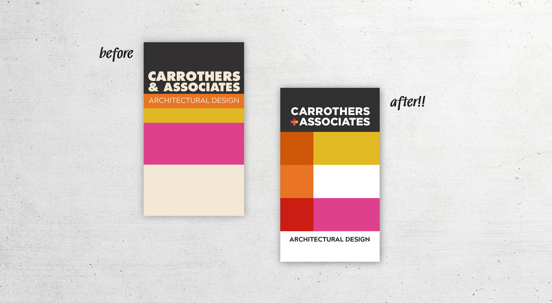
Carrothers had been using their original branding for 12 years when they first approached us. Their award-winning work has been featured both locally and nationally in print publications and on HGTV Canada and US networks. Being a well established architectural brand, we knew that it was time to freshen things up. Being mindful of the brand presence that they already had accumulated nationally and in the community.
Carrothers stands for the proud name of the owner David, whom built this company from the ground up. That’s why we decided to build the C out of strong, rectangular blocks. The C reflects their contemporary architectural design but also speaks to creativity and environment. Those blocks were then used to create the + sign as well, which represents all the associates within the company.


