The Garlic Box
Branding and Packaging Redesign
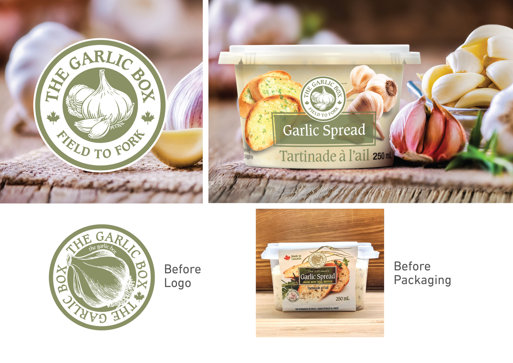
The Garlic Box was ready for a new and exciting refresh! The logo has been updated carefully with the brands core premise still there. Fresher fonts, more white space and an updated illustration. The packaging was also overhauled with a much cleaner aesthetic and new photography to really bring up that appetite appeal.


